Track all your orders from start to finish!
Mobile Order Tracking App
For this project, I created a mobile order tracking app for a fictional local restaurant. This app was designed to offer a wide variety of food choices for any time of day. They targeted customers who are working full-time or going to school full-time, and who order takeout and delivery at least twice a week. They specialize in the ability to track your orders from start to finish.
Project Overview
Problem & Goal
I was trying to solve the problem of busy individuals not having enough time to order food and keep track of when their food will be ready. My goal was to design an app for a local restaurant that would allow users to easily order and track their meals with minimal disruption from their work.
My Role & Responsibilities
On this project, I took the role of UX designer and UX researcher from conception to delivery. I conducted interviews through surveys, created paper and digital wireframes, created low and high-fidelity prototypes, conducted usability studies (accounting for accessibility), and iterated on designs.
Understanding the User
User Research
I conducted surveys and created empathy maps to better understand the needs of the users that I was designing for. A primary user group identified through my research was full time working adults who have limited time during the day and order food for take-out or delivery at least twice a week.
Research revealed that a big factor in the lives of busy workers was that they were annoyed with not knowing when their meals were ready for pick up or when they would be delivered. Many users wanted the ability to pin point at what stage their meal was at so that they could focus on their work and get their food the moment it was ready.
Pain Points:
Time: Working adults don’t have time during the day to make meals. They also don’t want to be disrupted from their jobs to constantly check their phones for updates.
Tracking: Most food platforms that offer pick-up or delivery do not offer a way for customers to know at what point in the process their food is at or when it will be done.
Personas & Journey Maps:
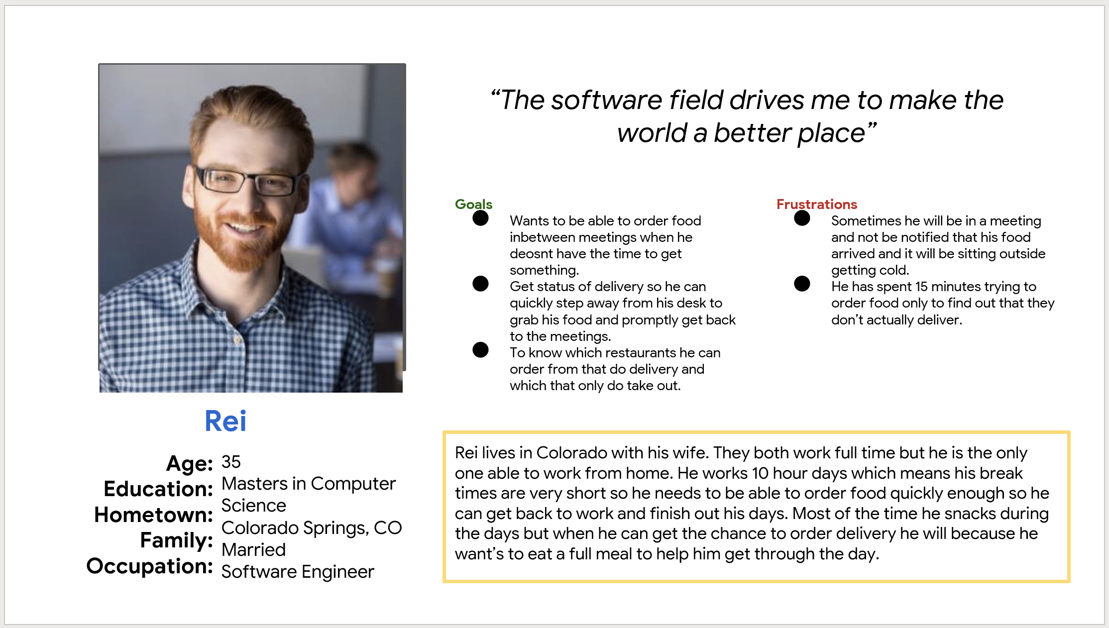
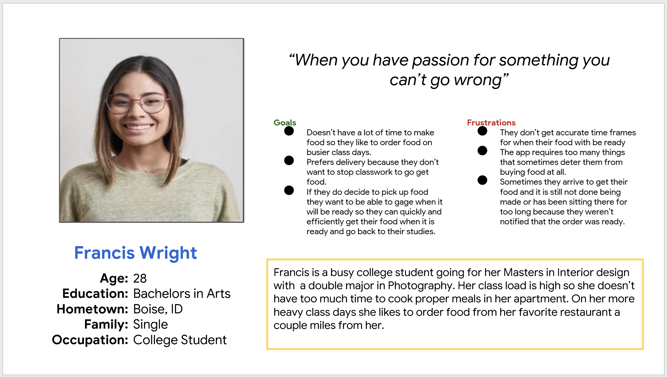
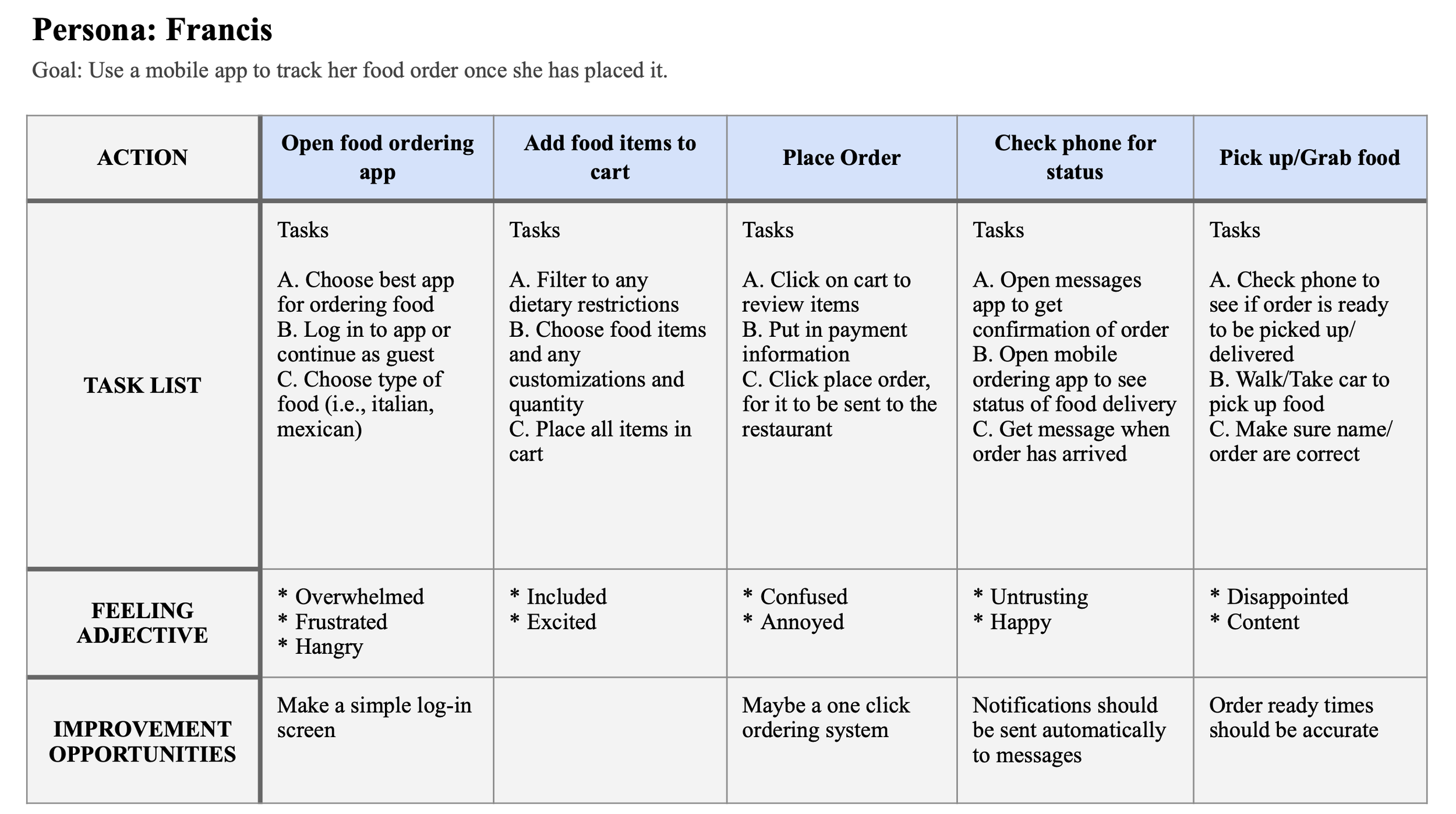
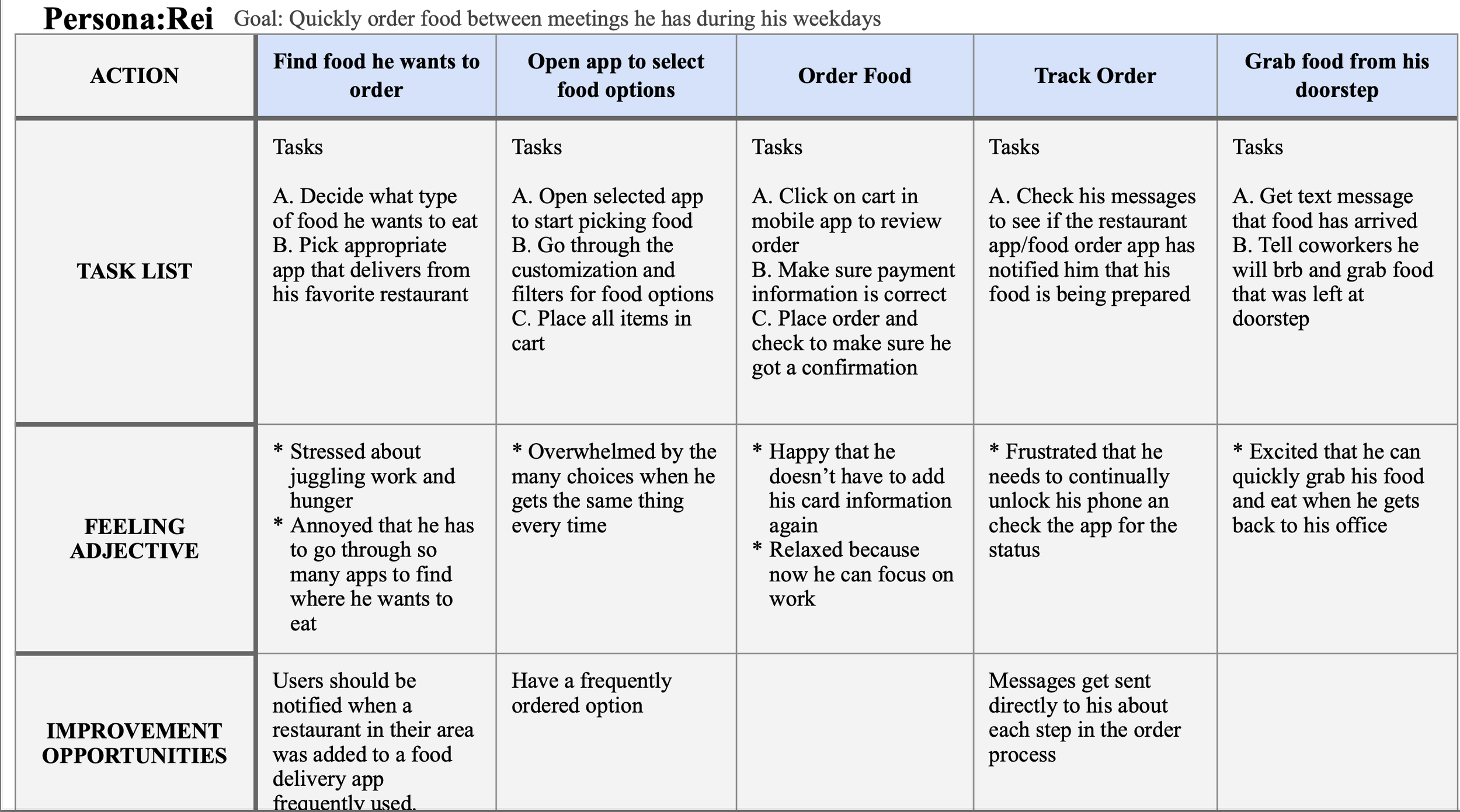
Two personas were created for this project. They try to represent two different types of users who this app was targeted at. I also created two journey maps to further explore issues and improvements that these users would experience.
Rei is a software engineer who needs to order and track his lunch quickly because he is usually busy in meetings during the week and doesn’t have time to stop and make lunch for himself. Mapping Rei’s journey showed that having access to an app that keeps him informed of his order status is a great use of time.
Francis is a busy college student who needs a way to be able to track the precise moment when her food will be delivered because she doesn’t have time to wait around or miss her meals when working on class. Mapping Francis’s journey shown that it would be helpful for users to have a simpler mobile order tracking app.
Starting the Design
Figma Digital Wireframes
The first iteration of the digital wireframes I changed a few things from the paper wireframes. In my refined paper wireframe, I thought having a search bar and the account profile at the top would look nice and be convenient. However, I found that a search bar wasn’t needed for this app and putting the account icon at the top of the page would be too small for users to see or interact with. I had to think about the user flow and how I wanted each page to look and what pages were actually needed. I wanted to give as much detail I could without letting the pages feel cluttered or busy. I included a page that gives a description of each menu item for the users who want to know the ingredients. Also, I added a page that allows users to edit their cart before moving to the order details screen. Finally, I created the account page for easy navigation of users’ past orders, rewards points, and stored card information.
Figma Low-Fidelity Prototype
In the low-fidelity prototype, I connected the pages to show the flow of what it would look like going through the app ordering a meal for delivery. The user flow would feature being able to track your meal at every stage of the process so that users would be able to mindfully order food and be able to know the exact moment their food is ready. This prototype was used to test users in a usability study.
Paper Wireframe
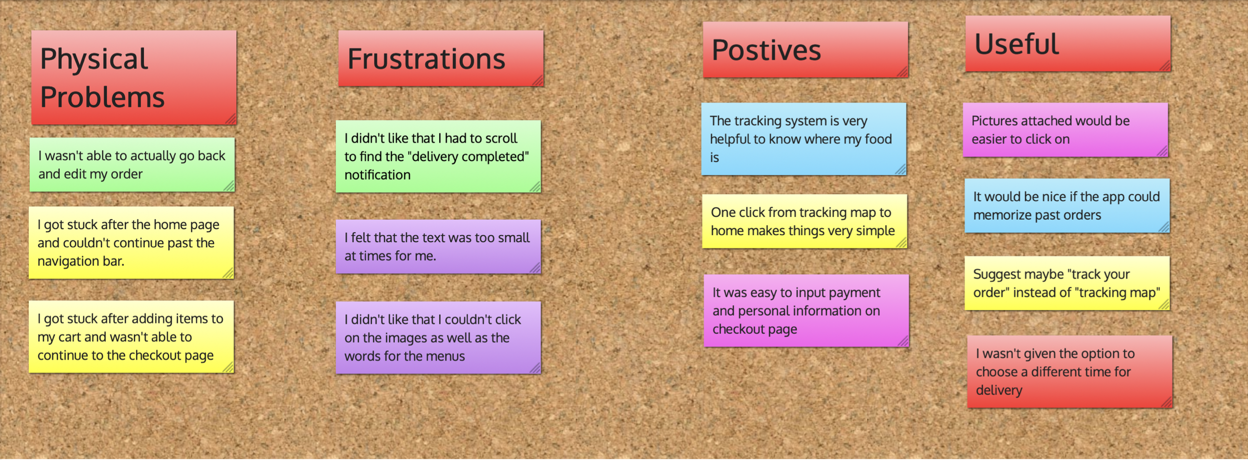
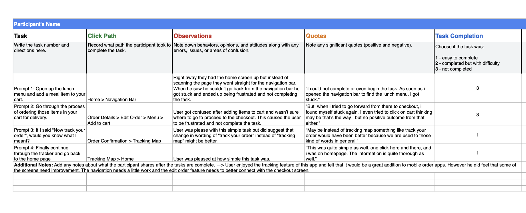
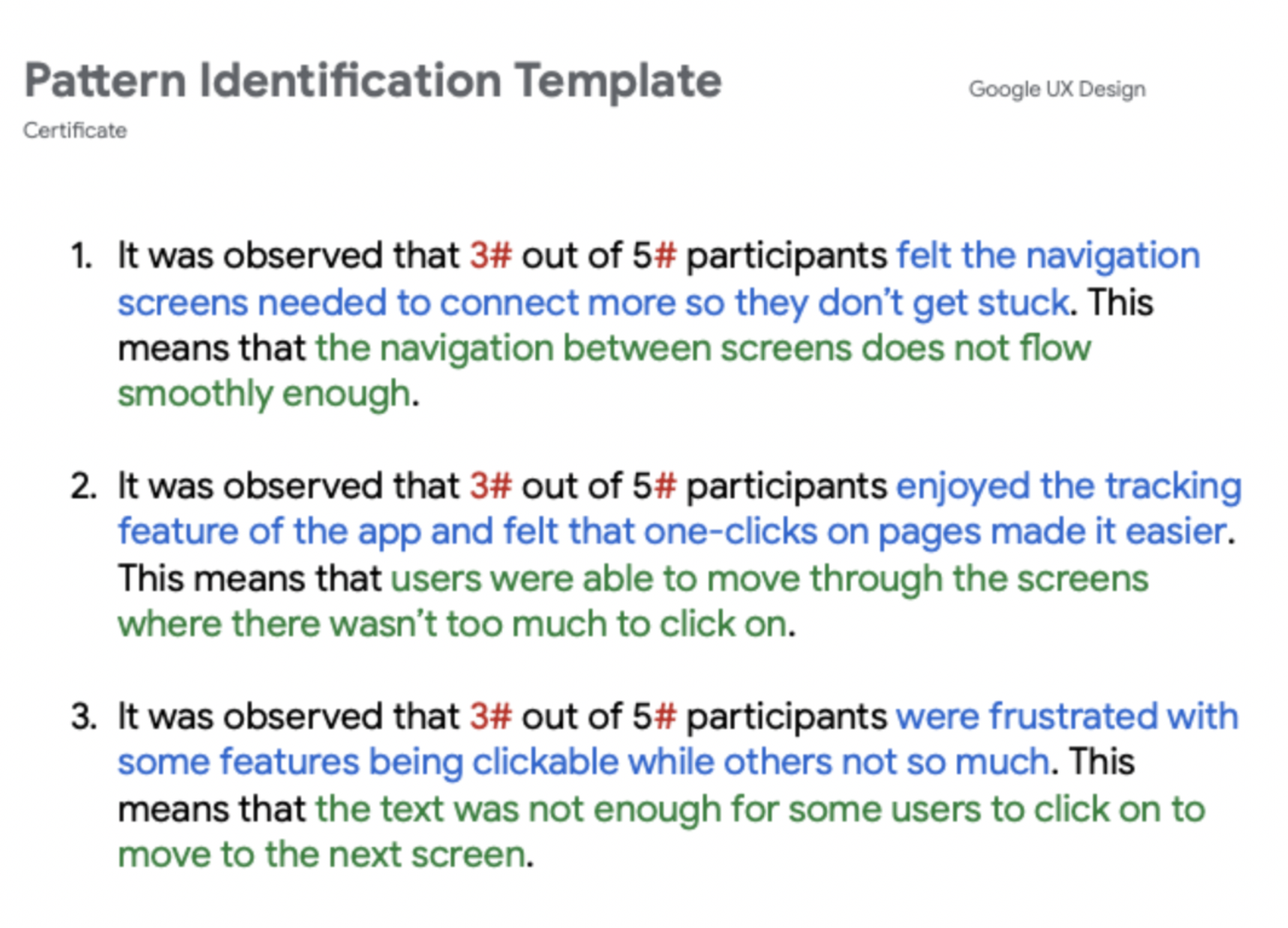
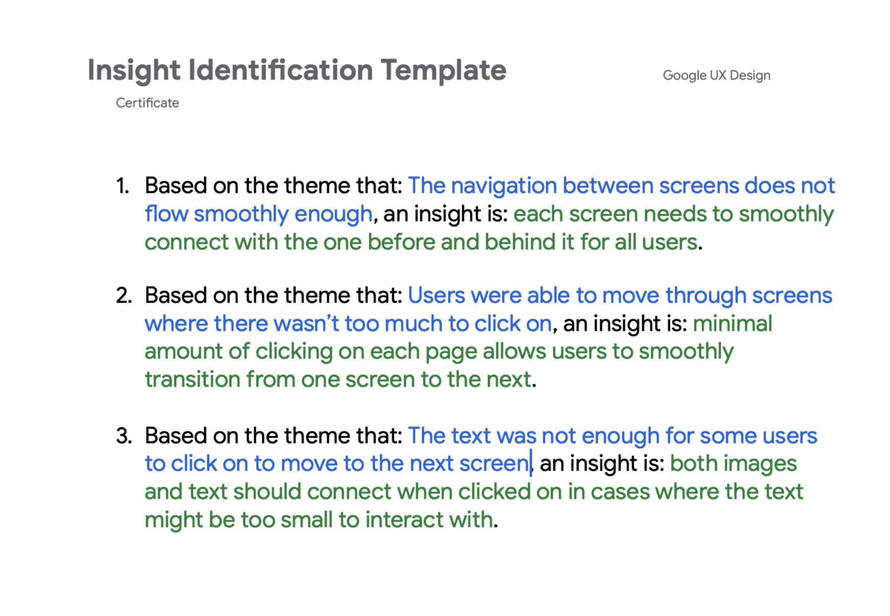
You will see the affinity board that was created for this project above. I arranged items based on physical problems, frustrations, positives, and usefulness. Creating this board made it easier for me to look through my notes and find themes and insights to use for the next round of iteration for the app. The Excel spreadsheet was used during the usability study to track the movements, issues, and feelings that each participant had while navigating through the low-fidelity prototyping test. All of these steps also play an important role in gathering the findings from each usability study done.
Usability Study: Findings
Round 1 Findings
The navigation between screens were missing components.
Minimal amount of clicks between screens made the flow smoother.
The ability to click on an image and text made it easier for users to move to the next screen.
Round 2 Findings
Text on certain items such as the menu and checkout were too small for users to read.
Having a back button on more of the pages allowed for smoother transitions.
Refining the Design
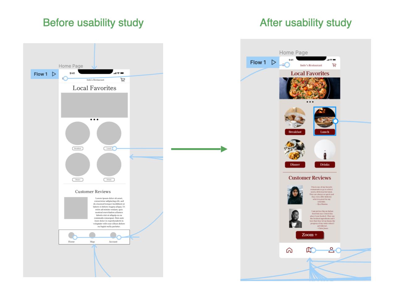
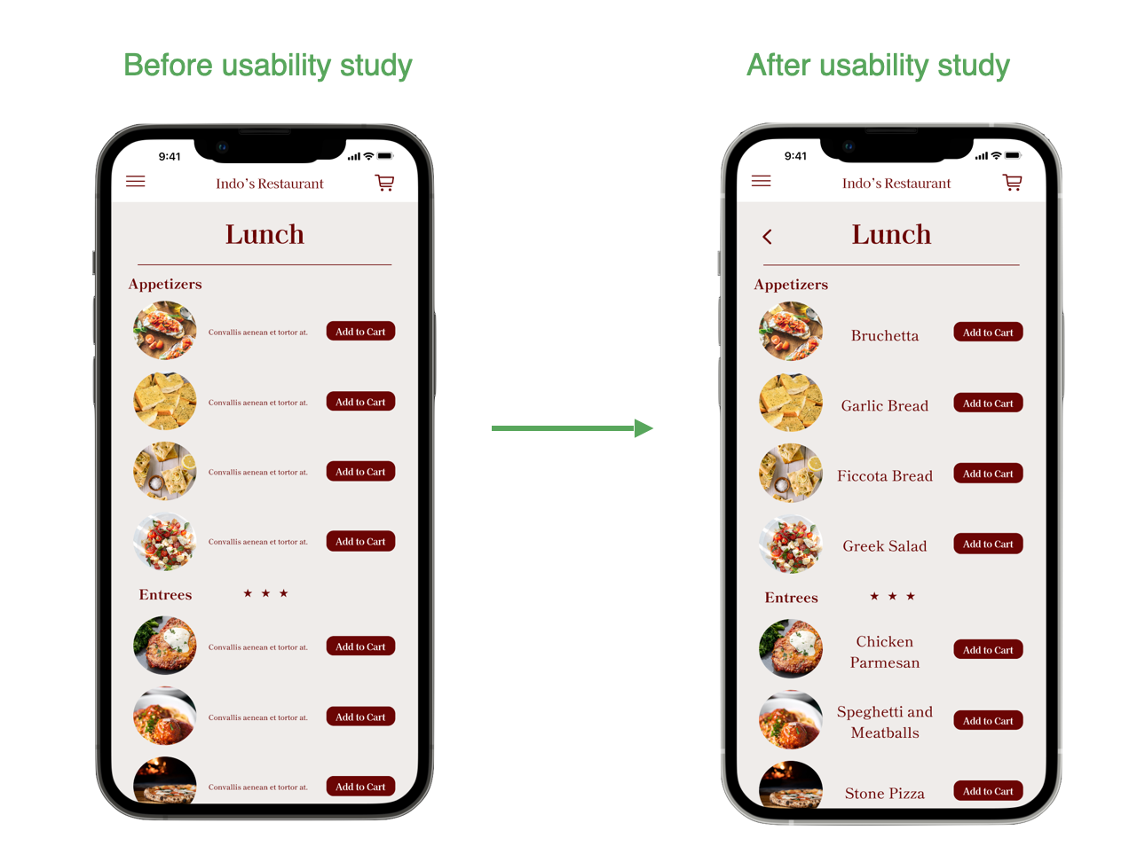
Mockups were created from the digital wireframes by adding color, images, and icons. Using my findings from my usability studies, I updated the navigation from the home page to the menu page by grouping the text and image box together to allow users to move forward more easily. Also, from the second usability study it was noted that the text was too small even for glasses wearers. These examples are only highlighting two of the changes made based off the usability text findings.
Figma High-Fidelity Prototype
In the high-fidelity prototype, I fixed some of the connection issues between pages. This prototype allows for a much smoother user flow when ordering and tracking meals that are placed through the app.
Accessibility Considerations
Provided users with accessibility needs such as the ability to access enable/disable features from the navigation bar.
Icons were placed in areas that users would be able to find with quickness and ease. Also, I made sure that text size and colors were comfortable for users of all types.
I used images where I could to ensure each page wasn’t text heavy. Users could then flow through the app more quickly by scanning images instead of having to read text.
Sticker Sheet
Going Forward
Takeaways
This app can really increase the positive interaction that users currently have with mobile food ordering apps. The most important thing I learned from going through this process is that your “first pancake” will never be perfect. This is a great thing however, because with usability studies, interviews, and constant iteration, we can really create amazing products to make users lives just a little bit better.


